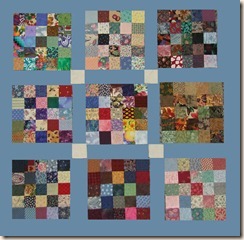
I have been working on my Y2K and have about 60 of the 80 blocks completed, the remainder is in strips ready to be assembled into blocks. Needless to say, they don’t all fit on the design wall.
I had been thinking of using either black


I asked on online quilter friend in Norway (gotta love the internet) to help me choose. Wouldn’t you know, she had a different idea – gray. I never would have thought of it, but she thought black might be too harsh. I think she could be right. So, this morning I dug through the stash and started pulling different colored fabrics to get an idea of what they would look like as sashing. Hey, if gray might be better, maybe another color might be even better! Changing fabrics on the design wall to try each color became laborious, and since many of my fabrics were prints, I wasn’t getting a good idea of how any given color would work. Enter MOTH (Man of the House) and Photoshop. So much easier to try different colors in Photoshop! Thanks, my dear MOTH.
Here is what a cement gray would look like: (and HG, I do like it, thanks for the suggestion and for getting me thinking outside my box)
hmm, a sick gold, was going to say spicey brown mustard, but I don’t think I’d want to eat mustard that was this color…….
or this ….odd shade of….brown?
Which would you use? Something totally different?


4 comments:
I think the chedder adds warmth to the design... if not navy..Moth
I like the red, but how about a charcoal grey? Have you tried dark green? Beautiful quilt.
I love the look of the navy blue. You may end up with everyone picking a different colour which in the end may end up more confusing that when you started. :)
I like the Red the best - and Navy second.... good luck!
Post a Comment